The 7 Elements of A Powerful Website
Make sure you have these 7 website elements that’ll have it selling for you, while you bask in the freedom of focusing on your life’s work.

It’s easier than ever to launch your new idea online. But beyond grabbing a domain name and a WordPress theme, launching a website that works goes a little deeper than a 5-step checklist. Everyone knows that they need a website, but not everyone knows how to leverage a website.
I’ve been responsible for designing and launching hundreds of websites, and can tell you that there are 7 elements of a website that’ll have it selling for you, while you bask in the freedom of focusing on your life’s work.
01
Irresistible Focus
With irresistible focus, your website will ooze a message that resonates with your audience right away. To get this right, you’ll want to define clearly what you want your website to do, where it fits into your customer journey, and what you want your users to do on each page of your site.
With the right focus, your website is your greatest marketing asset—and it should handle most of the pitching for you. By the time someone contacts you through your website, they should already be very clear about their choice to hire you—because you’ve connected with them in a way that only you can. To get this right, you’ll need to invest some time for clarity and discovery before a single pixel hits a canvas or screen.
02
A Structured Customer Journey
Taking the time to think about how to structure your site so that it makes sense from your client’s perspective is key in the early development of your website. In event design, there’s a concept called “wayfinding” that works well when thinking about your site structure too! Think back to the last great event that you attended. Can you remember the signage that directed your path? The program that helped you to understand what was coming next?
Consider all of those wayfinding details and then map out your the customer journey for your website, applying those same principles. What’s it going to take to get users from the page they land on to the desired action you want them to take on your website? What do they need to know, think, and do to get right in the sweet spot of where you want them to be?
03
Visual Hierarchy
Visual Hierarchy is the technical term for the information your text conveys before your user even reads any words. How you arrange your hierarchy tells the user that there’s a pecking order to things: some content should be viewed first, second, third and on down the line.
When you use visual hierarchy, you understand that the design of your blog controls how users consume the information on your website—and you understand that you’re in control. Make important items on your site stand out by making them easy to find. And, for the love, please use your h1, h2, h3, and h4 headings properly to make both your users and the Almighty Google happy.

04
Brilliant Images
So many people underestimate the power of photography. Let me be clear, the images you choose are absolutely fundamental to the success of your website. Nothing sets the right tone in a split second like a gorgeous image. I’ve art directed many photoshoots with my clients and I can tell you that this one element is so pivotal to the success of your website.
Work with a photographer you trust to capture lifestyle images, candids, and headshots that turn your business into a trusted destination brand. Or, if you’re not quite ready for a full photoshoot, curate a collection of stock photography that you can turn to again and again.
05
Compelling Copy & Calls to Action
Engaging copy draws a reader in, connects on an emotive level, builds rapport, and makes the next action oh-so-clear. Always make sure it’s obvious, through the design and the copy, what you want your website visitor to do next—read a blog post, add a product to their cart, register for an online course, download a guide, or simply opt-in for more details about what you’re cooking up.
If you haven’t already invested in your copy, consider working with a copywriter to bang out your website content. I’ll often suggest that we pull in one of my trusted partners in a website design package—because getting the words right is pivotal to your online success.
Having opt-ins available on your site allows users an opportunity to ask for seconds—after devouring a healthy plate of your content. Use enticing copy to get users to subscribe or offer a high-value freebie (lead magnet) that will be interesting enough to make them give up their email address for it. An effective lead magnet will take you no more than 2 hours to create and will be something your subscribers can consume within 10 minutes.
06
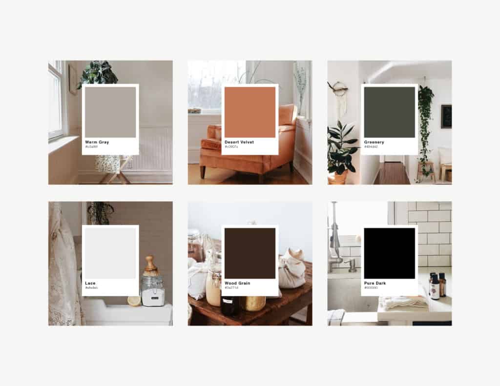
Color Theory
Did you know that studies show that if action items are a consistent color throughout the website, conversion rates are higher? It doesn’t matter what color it is—if you have one color that you consistently use to tell your users to take action, you’ll get far more conversions.
When I create a color palette for a client, I’m keeping their conversions in mind. I’m curating a color scheme that will help to draw a reader’s attention, if used intentionally. But I always suggest minimal user of color in the website design, to help guide readers towards those action items that use color.
Color psychology should also come into play here. Colors evoke emotion in humans. There’s an entire world of science behind it! Make sure you’re evoking the right emotion every time you choose to use any color on your website.
07
Typography
Typography can make or break a website design. I recommend that you stick with two fonts that are easily legible—maybe a mix of serif and sans-serif to differentiate between body copy and headings. Stay away from script or strong display fonts, except in your logo and maybe a few small details. Need some inspiration? Check this out.
Now that you’re a little more familiar with the critical elements of a persuasive website, take a few minutes to ask yourself:
- Is the focus of my site clear and irresistible?
- Will my customers/readers follow a clear path through a structured customer journey on my site?
- Do the elements of my website have a clear visual hierarchy?
- Am I using images and photography that set the right tone for my brand?
- Is the copy on my site compelling? Am I guiding users towards a strategic call to action?
- Am I using color theory and typography to evoke emotion in my users and guide them to take action?
If you’re not sure you can answer these questions, I’m available for strategy sessions. I’d love to help you gain some clarity!

Brand Strategist